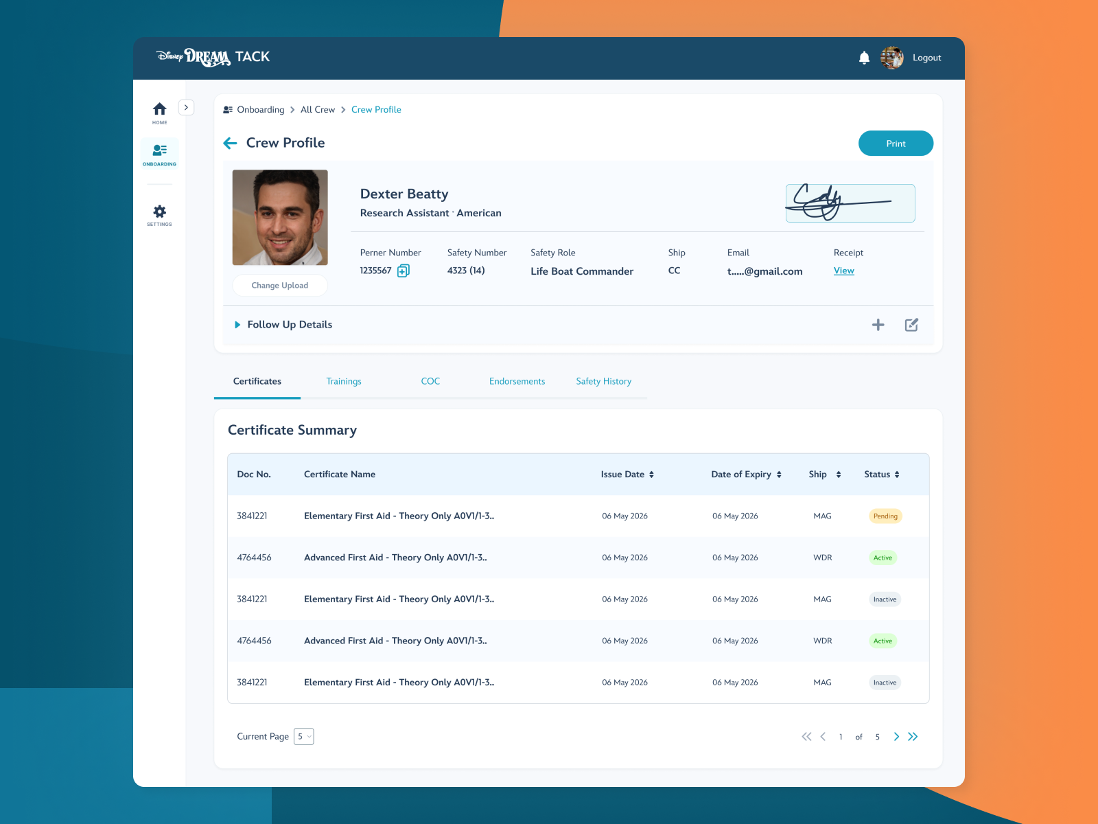
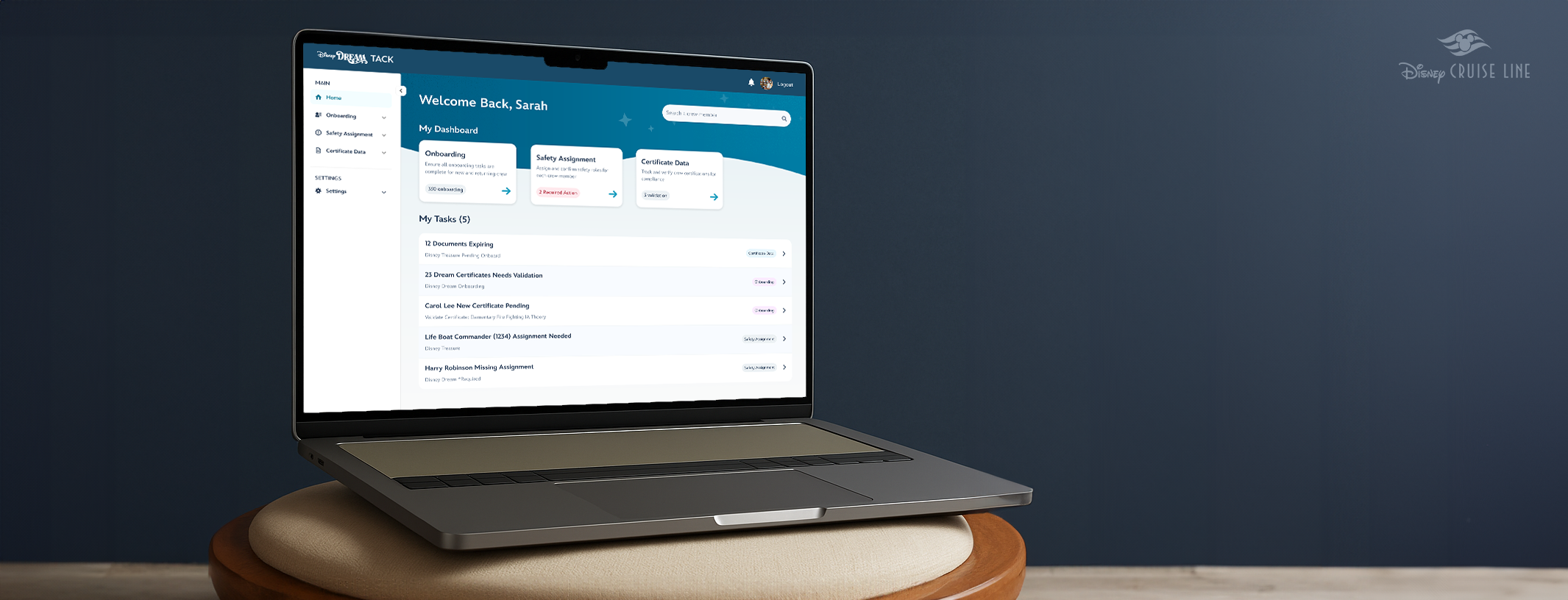
As a lead designer on this project, I modernized a 12 year old legacy tool from zero to one. a centralized place where new hires get onboarded, validate documents, certificate, and manage their profile on board.
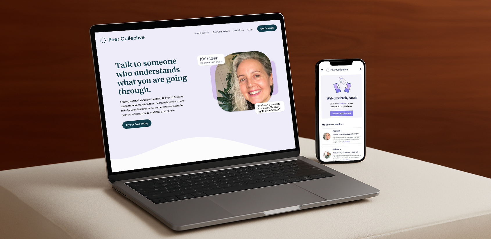
I created a consumer facing app POC and a internal dashboard for therapists, After the final prototype was completed I conducted user research with real therapists to validate design decisions and implement changes.
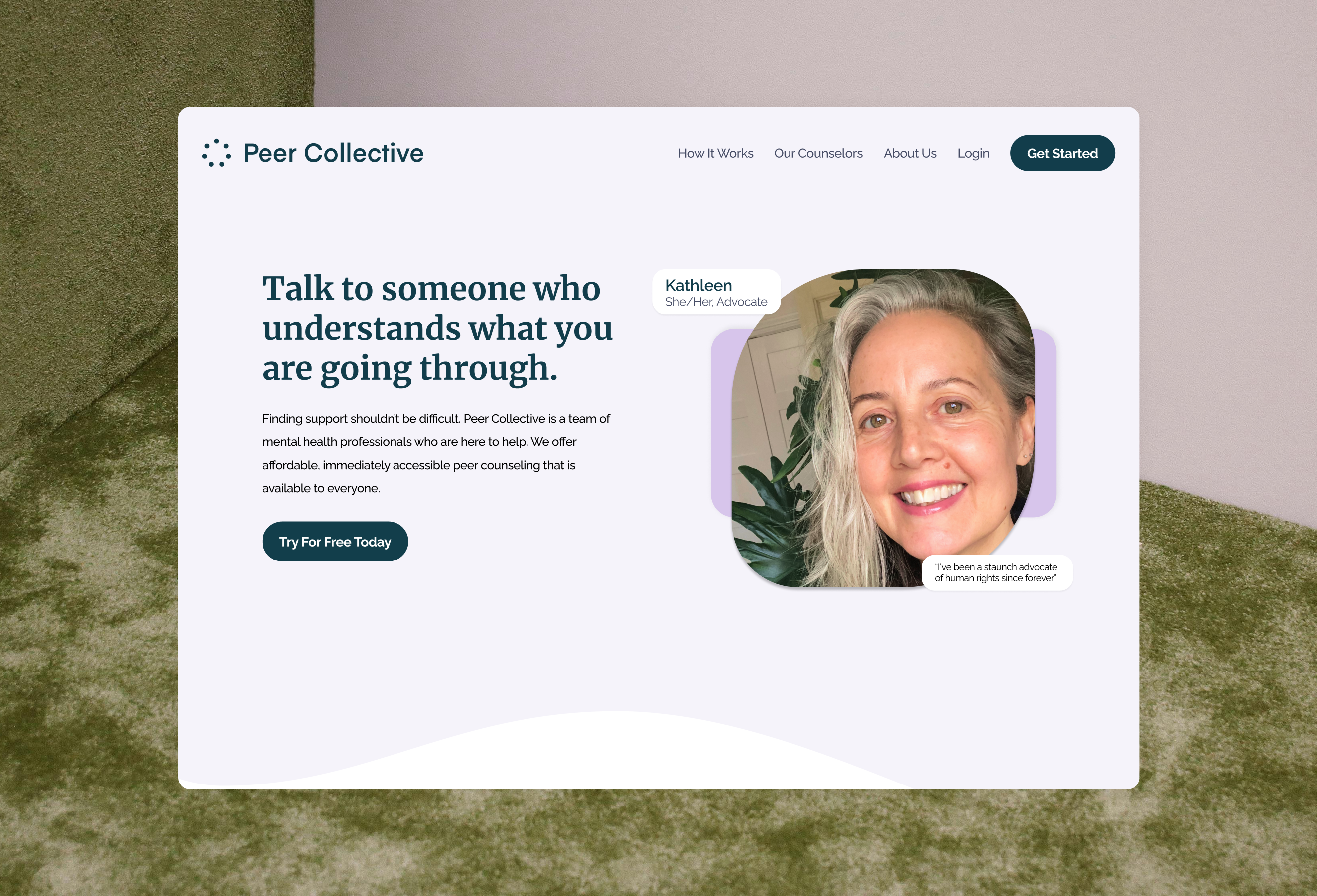
Peer Collective offers virtual peer-to-peer counseling to reduce cost and access barriers. As the sole designer, I redesigned the end-to-end web + mobile journey with transparent counselor profiles, a guided match flow for first-timers, and a streamlined booking experience with clear availability + pricing.
Project Goals
Reduce friction from profile → booking → confirmation across web and mobile.
Introduced a tailored onboarding questionnaire with sensible defaults and filters.
Build trust up front with transparent credentials, focus areas, and session expectations.
My Impact

A clearer, faster path to a first session with the focus on fewer steps, resulting in less decision fatigue.

Higher confidence at checkout via transparent pricing and plain-language policies.

Helped secure $1M+ in funding following the MVP launch.

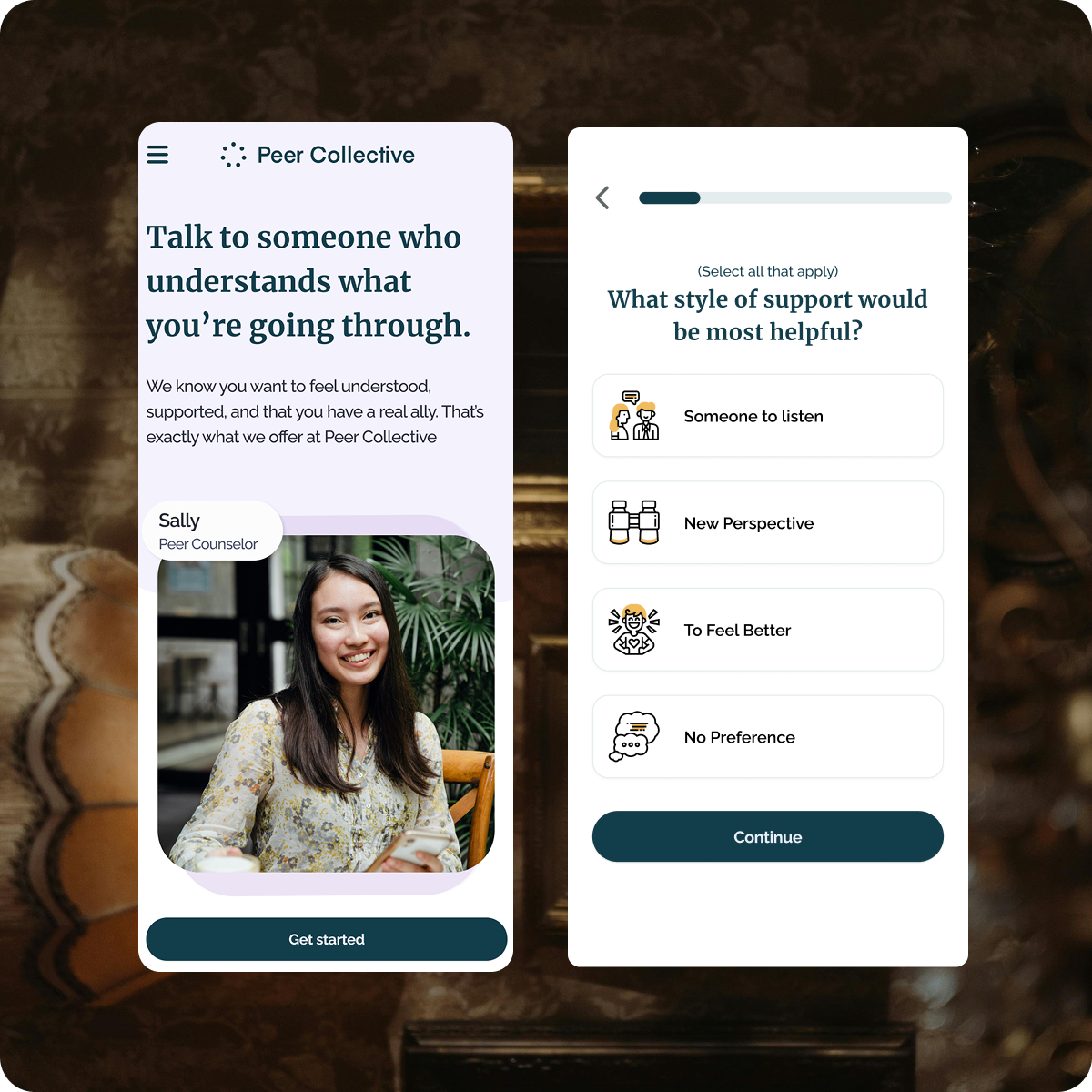


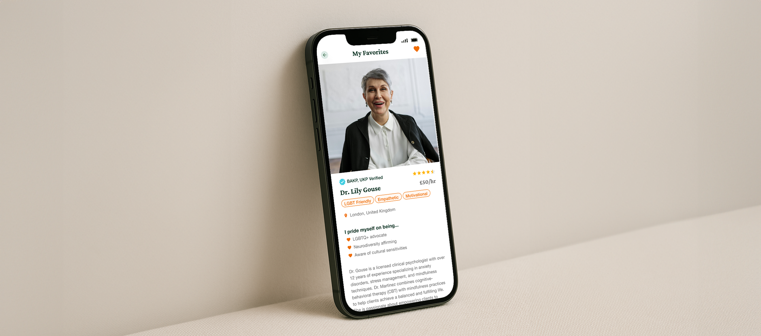
A UK founder brought me in on a short-term contract to kick-start a two-sided mental-health platform: a provider workbench for how clinicians run their day, and a guest app that quickly matches people to the right therapist. I designed both concepts end-to-end—an onboarding/matching quiz with explainable results, transparent pricing and availability, a calm booking flow, plus provider setup for specialties, availability, and intake—so finding help feels simple, fast, and trustworthy.
Project Goals
Make provider matching easy and simple for guests.
Surface fit, availability, and pricing up front to lower drop-off.
Give providers a lightweight, efficient way to manage profiles and schedules.
My Impact

Faster path to a good-fit therapist, fewer abandoned searches.

Crafted POC and it is ready for investor funding rounds

Completed design POC within 2 months

Created Branding, style guide and component library


Project Goals
Remove adoption blockers and speed design→dev tech debt.
Provide reusable, accessible components/tokens that allow brand variation.
Establish contribution, release, and documentation practices.
My Impact

20–80% adoption across 8+ brands; baseline for the React migration.

Faster delivery, fewer one-offs within a single documented library.

Secured joint efforts + roadmap with Engineering for ongoing investment plan

Create an aligned experiences across the portfolio.


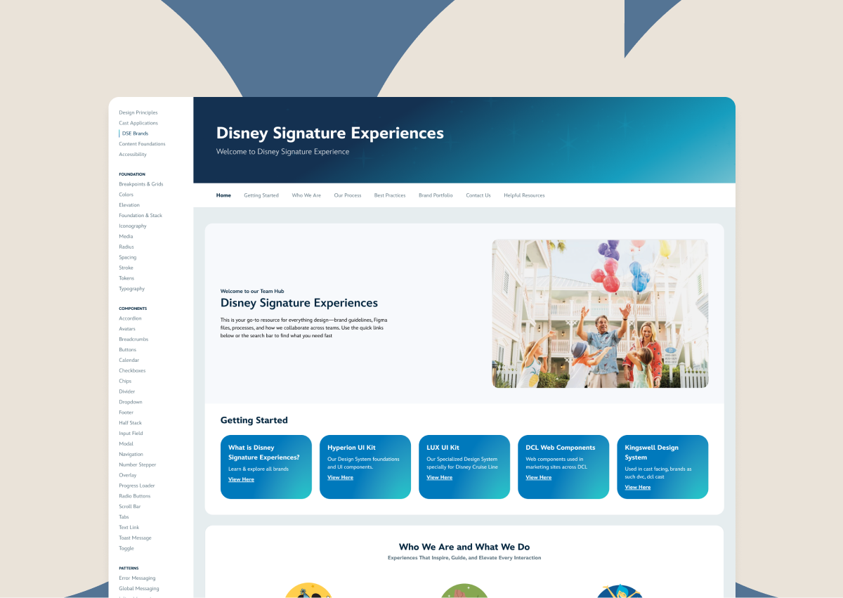
Docs and know-how were scattered across tools, making it hard for teams (and new hires) to find people, projects, and standards. I owned the UX and content structure for Team Hub—a single, searchable home for our people directory, project pages, ways of working, and design-system links—so everyone knows where to start and how to move work forward.
Project Goals
Create a clear entry point to design-system guidelines, templates, and rituals within the Disney Signature Experiences Team
Centralize resources, onboarding, and standards in one place.
My Impact

Page is in progress of being added within our design system library

Will eventually become the centralized source of truth for our team


Project Goals
Consolidate disparate headers into one modular system that scales across brands and devices.
My Impact

One standardized header replaces multiple patterns—faster rollouts, less QA surface, easier maintenance.

Reusable component kit + guidelines accelerate adoption and keep experiences consistent.

Pilot launched on Imagination Campus; the standard inspired follow-on refinements and migration conversations across other brands.

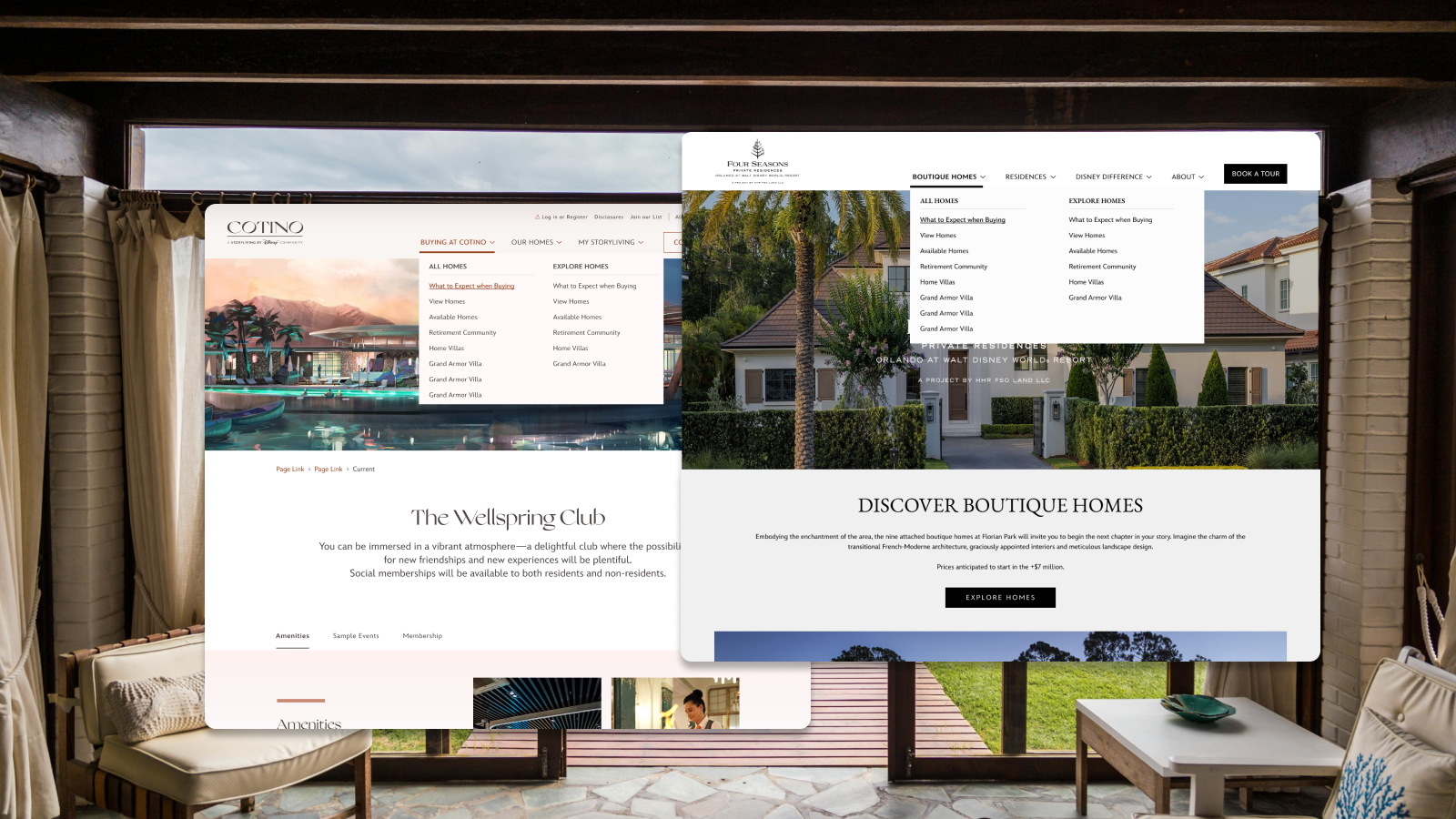


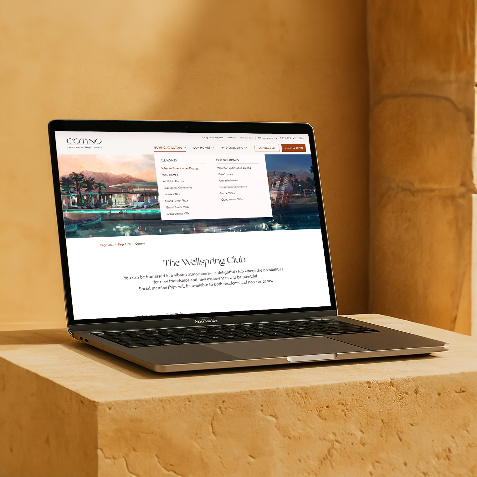
Golden Oak and Four Seasons are launching a new luxury residential community, but the site was static. Guests had to call or request PDFs to see plans or media. I owned the UX/UI design in partnership with a Lead Designer, creating an interactive Floor Plan Viewer and Media Gallery that bring homes to life on the page. Guests can zoom into layouts, switch variants, and browse photo/video in a simple, elegant experience—so they can picture themselves there and reach out when ready. It is built to work on today’s site and grow as the project expands.
Project Goals
Turn static pages into self-serve exploration that builds confidence.
Keep the luxury brand feel while making the path to inquiry obvious.
My Impact

Buyers can view plans and media directly on the site—no PDFs or phone calls required

Clearer, more inspiring preview of the homes leads to more qualified inquiries/sign up

Reusable components set a scalable foundation for future brands


NatGeo Expeditions and Adventures by Disney were scaling expert-led travel, from private jet journeys to Antarctica. Their legacy trip selector was a text-heavy dropdown that hid the catalog. As the Trip Selector designer, I partnered with a lead on cross-brand vision and reimagined search as discovery with an imagery-first selector that scaled across both brands.
Project Goals
Turn search into a discovery experience that connects guests to the brand instantly.
Inspire exploration with an imagery-first selector by destination, trip style, and dates.
Improve early-funnel engagement and decision-making so guests choose trips with confidence.
My Impact

Reached 3M users in the past year

Successfully scaled the Trip Selector to 2 brands (and counting)

Drove +28% engagement, and usability testing showed 100% preference for the new experience


As Disney Cruise Line grew to a 13-ship fleet, I was the sole product designer modernizing a 12-year-old crew certificate system. I consolidated four tools into one platform with a new dashboard and real-time status capture, streamlining onboarding and helping prevent unqualified duties with paperless, instant updates while leveraging AI.
Project Goals
Unified storage: Collect and store all certificates in one easily accessible, searchable location.
Monitoring & tracking: Track each crew member’s safety training, signatures, and certificate status.
Simplified operations: Replace multiple apps with a single system that provides real-time updates and easy access.
My Impact

Reduced 4 tools → 1 unified platform (end-to-end)

Removed tedious check-in process from onboarding & check-in from 10 → 2 screens

Status updates now immediate vs. 6+ hours before

Removed Paper tacking → seeing real time live updates



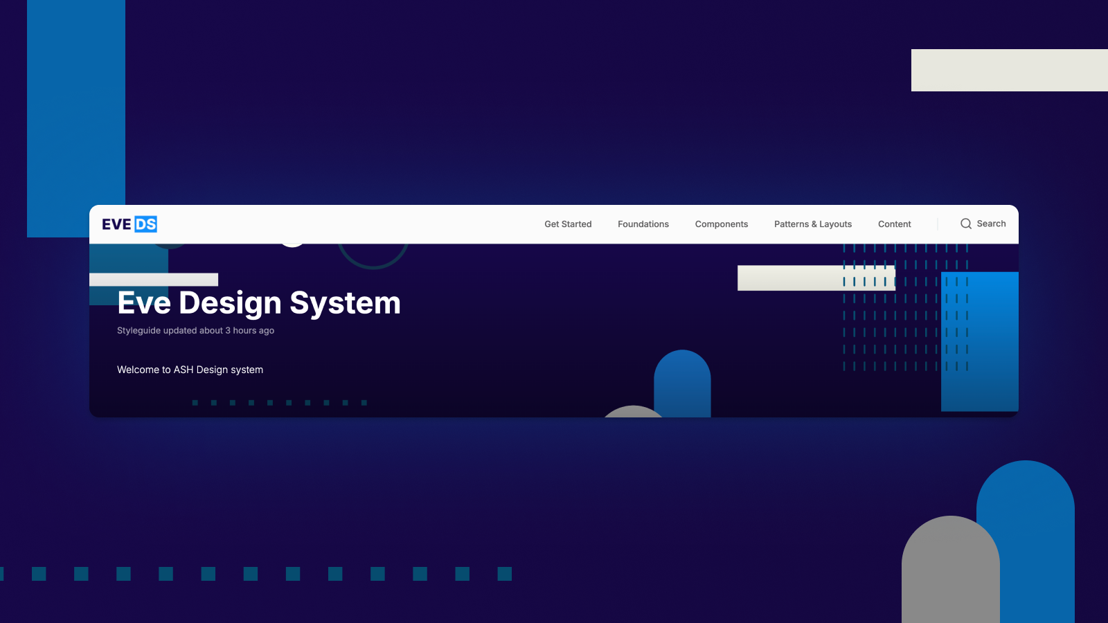
Project Goals
Increase efficiency between design and code to streamline handoffs and reduce rework
Create reusable components and tokens to drive consistency across internal and external apps
Simplify experiences while supporting brand variation and accessibility
My Impact

80% increase in adoption across 8+ brands; foundation for the React migration

Faster delivery and fewer one-offs through a single, versioned library and guidelines

Secured joint budget and roadmap with Engineering for ongoing investment

Clear, consistent experiences across the portfolio



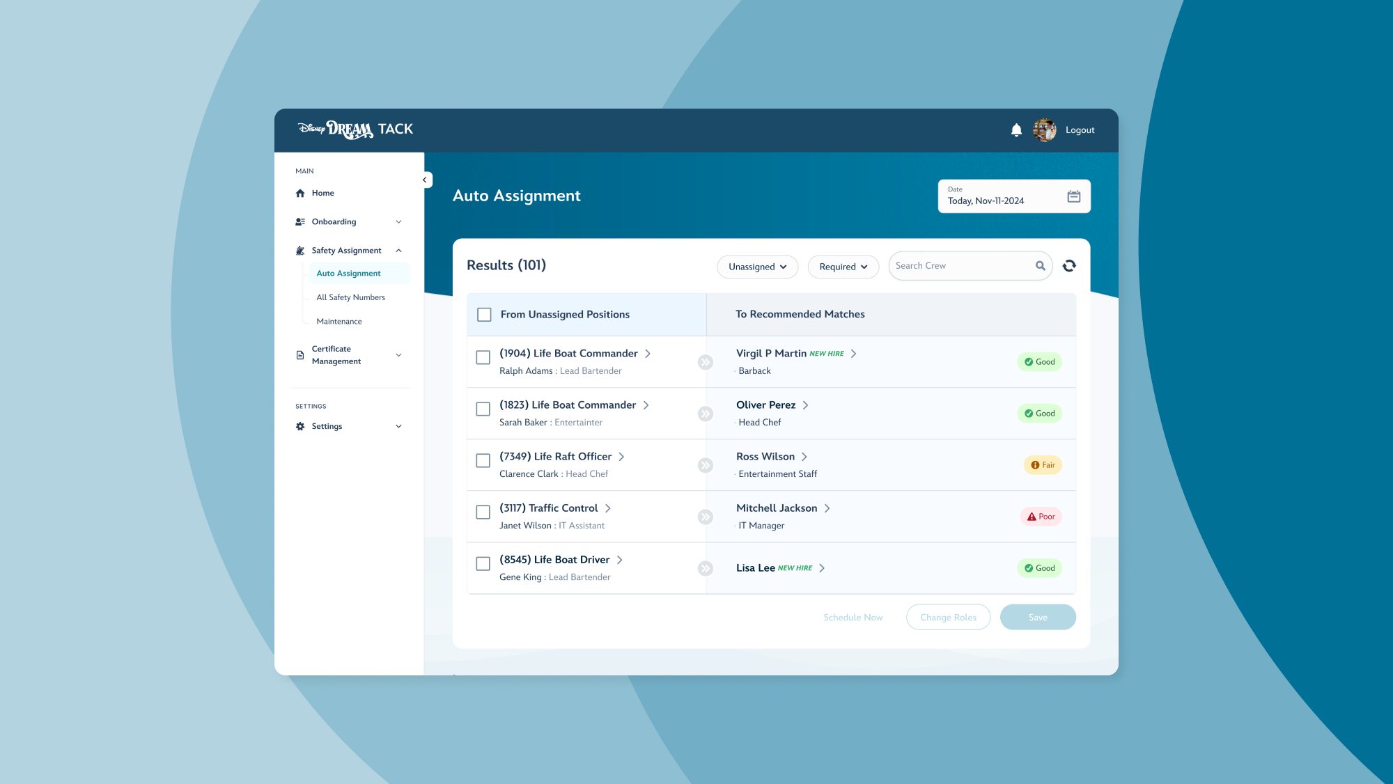
Disney Cruise Line has a legacy employee management system with a goal to better manage crew certificates, streamline onboarding, and centralize crew data in one place.
Project Goals
Unified Storage: Collect and store all certificates in one easily accessible location
Crew Admin Dashboard: Monitor and track the status of safety training, signatures and other certificates for all crew
Simplified organization: Replacing multiple apps with TACK’s single storage system for easy access, print receipts, and check in on updates
My Impact

4 tools → 1 platform (shipside & shoreside)

10 screens → 2 for assignment/check-in

~50% faster cycle; status updates post-check-in are immediate

Removed Paper → live validation blocks unqualified assignments


